The Association of College & Research Libraries (ACRL) conference in Pittsburgh, the City of Bridges, was a phenomenal experience in multiple ways. While the weather was cold and blustery and it rained one day, the views from the conference center over the river were relaxing and beautiful, meeting up with old friends and networking was wonderful, but most importantly, I learned SO MUCH!

I had two foci for this conference: Universal Design and how to best serve faculty, researchers and students with information about scholarly publishing.
But first, a few bullet points that I learned while talking with vendors:
- Endnote 21 desktop version is coming out soon.
- Preprint repositories will soon be linked within Web of Science; they will also be in Primo when we go live with Primo.
- ProQuest dissertations will be moved into Web of Science this year
- When searching ProQuest databases, you can click on the journal title in an article record and it will show you the Journal Citation Indicator impact number.
- The Journal Citation Indicator will be going to one decimal this summer.
Universal Design
The conference was filled with information about Universal Design (UX) features within Library Guides, Canvas Pages and any learning objects that might be distributed to students. The programs I attended– “Accessibility, Universal Design for Learning and Your Online Learning Objects”; a lightning talk, “Intentional Line Breaks for Accessible Video Captions”; and “Everything You Always Wanted to Know about UX”–all stressed the importance of this being an “all hands on deck” buy-in from staff and a constant conversation about information surrounding UX.
While some of the information such as using Headers and Styles within Microsoft Word and Google documents were great reminders for any document you are creating, other great tips focused on how to make images more accessible. Suggestions included:
- Don’t include the words “image” or “photo”; the screen reader will pick up that you have inserted an image.
- Don’t put in images where they are not necessarily needed, and if it is a decorative image, you don’t need to describe it.
- In your descriptions of images, be concise, put the most important information first and think about what the student should learn from that image.
- If you are placing a complex image (a chart, etc) write the description first, then do the screenshot. Always have a link to an explanation of the data if its too much information to place in the description.
- If you are including a head-shot of someone, think about if the head shot portrays something specific about them and describe if relevant. (i.e. are they fishing next to a lake?)
There are a number of toolkits out there such as the NYU accessibility toolkit and the Wave Web Accessibility Tool that are helpful in describing common and fixable UX errors.
The “Intentional Line Breaks for Closed Captions in Videos” session really made me think. Paying attention to how long the wording is, and whether it matches what is on the screen is very important. Other tips included: keep the lines 36-40 characters long; lines should be similar in length; insert line breaks after commas and before conjunctive words (and, or, but); and finally, add two line breaks after the end of a sentence. This session gave so much information in just 10 minutes.
Publishing
Preparing for a seminar on publishing for a research group in the School of Education, I was lucky enough to have a number of great seminars on this topic. The Business of Publishing: A Library Information Literacy Workshop for Masters-Level Students was presented by librarians from Columbia University. The workshop used the ACRL framework and addressed how they taught the students five areas:
- Setting goals for writing
- Identifying platforms to publish on
- How to contact editors
- Navigating and retaining copyright and
- Networking opportunities within their disciplines
The course information is available on their commons website: https://academiccommons.columbia.edu/doi/10.7916/a9fv-7w41
“Shaping the Future of Library Support for Graduate Student Authors: Addressing Gaps in Publishing” from the UC Santa Cruz libraries was also fascinating. They hired a grad student to do interviews with other grad students. Their results indicated that teaching a workshop would involve focusing on four things: publishing strategy, how to face rejection, the cost of publishing (open access) and finally what to talk about with their advisor or expectations from the university.
I went to a fascinating talk on Text Recycling otherwise known as “self-plagiarism.”.The Text Recycling Research Project (TRRP) has been around since 2015. They work with publishers, scholarly societies, government research agencies and research integrity officers to provide guidance on reproducibility of portions of previously published works. TRRP looks at three main areas when looking at text recycling: the beliefs and attitudes of researchers surrounding reusing portions of text: the text analysis; and the legal analysis including copyright, ethics and contract law. The Flow Chart on page 2 of this document looks at the types of text recycling. The talk looked at a classroom context and encouraged campus wide policy drafts on reuse of papers in a class.
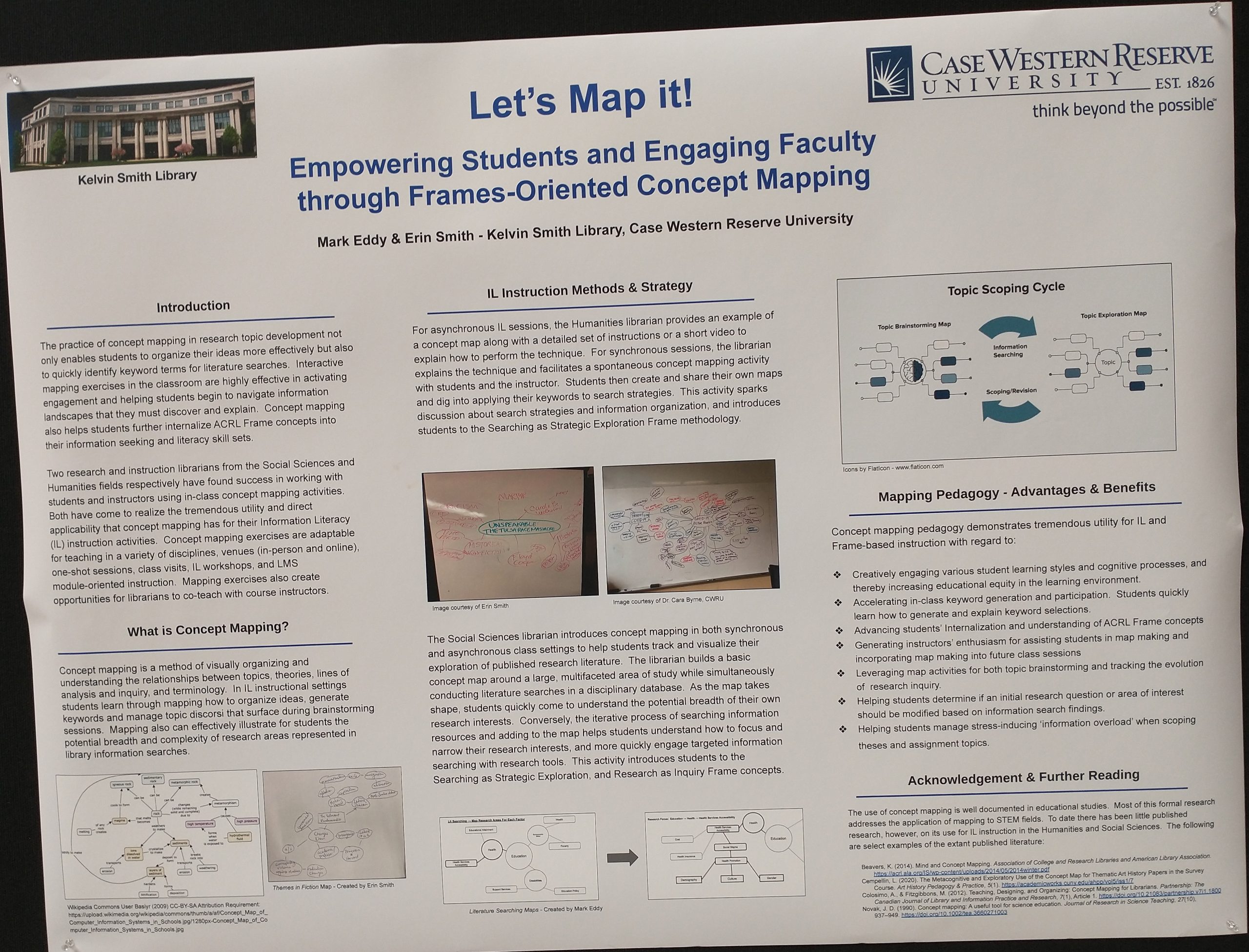
Poster Sessions
Here are a few photos of some great posters during the poster sessions. There were three poster session events and each of them was filled with great ideas.

Being new, I got to know my coworkers much better on this trip. Jim Gillispie and I drove together and Katy Troeschel and I attended a few events together. We all attended the ACRL St. Patrick’s Day party at the Heinz History Center Museum where we had the pleasure of eating dinner at a corned beef and a baked potato bar and seeing the Mr. Rogers Neighborhood exhibition. All in all, a great conference experience.