 For those studying Baltimore’s social, economic, and redevelopment history, one of the most frequently referenced maps in our collection is the Residential Security Map of Baltimore Md. Published in 1937 by the Federal Home Owners’ Loan Corporation (HOLC), this map is often called the Baltimore redlining map. In drafting the map, cartographers used the colors red, yellow, blue, and green to “grade” Baltimore neighborhoods based on potential risk factors for residential mortgage lenders. Areas shown in red, “Fourth Grade” or “D”, were consider the highest risk areas. In the narrative documents associated with the map, the risk factors for the lowest grades, “D” and “C”, include terminology that often evokes racial overtones. “The fourth grade or D areas represent those neighborhoods in which the things that are now taking place in the C neighborhoods, have already happened. They are characterized by detrimental influences in a pronounced degree, undesirable population or an infiltration of it. Low percentage of home ownership, very poor maintenance and often vandalism prevail. Unstable incomes of the people and difficult collections are usually prevalent. The areas are broader than the so-called slum districts. Some mortgage lenders may refuse to make loans in these neighborhoods and others will lend only on a conservative basis.” During the depression, the HOLC produced Residential Security Maps for over 150 U.S. cities. Yet most of these maps were never widely distributed and few are found in library map collections. One of the earliest scholarly looks at HOLC maps was by Amy Hiller as she focused on the City of Philadelphia in “Redlining and the Homeowners’ Loan Corporation.”
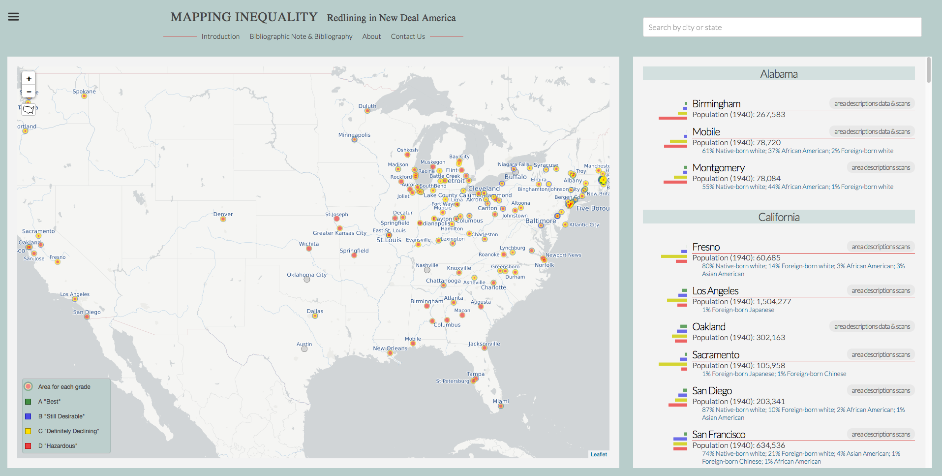
Later works, including contributions by Johns Hopkins History Professor Nathan Connolly, can be found on the website “Mapping InEquality: Redlining in New Deal America.” This fabulous site serves as a gateway to the widest array of georeferenced Residential Security maps along with images of archived HOLC neighborhood assessments. 1930 and 1940 population figures on race and foreign-born are also included along with a clever tool that highlights grading and density outward from the city centers. The subscription, database PolicyMap also recently added a new section called Historic Lending Boundaries incorporating HOLC content. The Sheridan Libraries copies of printed Baltimore Residential Security maps came about via our search of the HOLC records at the U.S. National Achieves (Record Group 195, Box 106). Since 2008 we have made high quality digital scans of this Baltimore map freely available for viewing and download via JScholarship, our institutional repository. Also included in our collection is a draft version of the map prepared in 1936. For Johns Hopkins GIS users, a georeferenced copy of the map is also available via ArcGIS Online for Johns Hopkins. It is good to see our library’s copies so widely used and referenced in other sources. For more information, contact Jim Gillispie, GIS Librarian and Curator of Maps jeg@jhu.edu, 410-516-4816.
2 thoughts on “The Baltimore “Redlining” Map: Ranking Neighborhoods”