Part of a monthly series of posts highlighting uncovered items of note, and the archival process brought to bear on these items, as we preserve, arrange, and describe the Roland Park Company Archives.
Correspondence files, both incoming and outgoing messages typed on paper, represent nearly 80% of The Roland Park Company Papers (not counting the architectural drawings). In addition to the vast amount of historical insight provided by the content of that correspondence, these files can also offer an often-times delightful look at the very method of communication and advertising of the past. We may marvel at the difference in language, for instance, in movies about the early 20th century and the fact that what sounds quite quaint to us was normal to the ear then. Just this perspective on how language changes can be a rewarding experience.
Interestingly, there was also a large visual component to communication in the past, and contemporary people were certainly aware of it. In his book, Crowning the Gravelly Hill: A History of the Roland Park Guilford Homeland District, James F. Waesche has the following to relate about Edward H. Bouton, first president of the Roland Park Company:
One hopes that Bouton took pleasure in the design aspects of Roland Park’s development, because, former cowpuncher though he may have been, he was a man of refined taste. Little hints of that come through from time to time- as one does on the occasion when he ordered the company’s first stationery.
“We will not want any vignettes or other ornamentation,” he instructed, “but will prefer the matter done in a tasteful script … [on] woven linen paper. . . ”
(Bouton to Baldwin & Gleason Co., Ltd., a New York stationer, August 5, 1891)
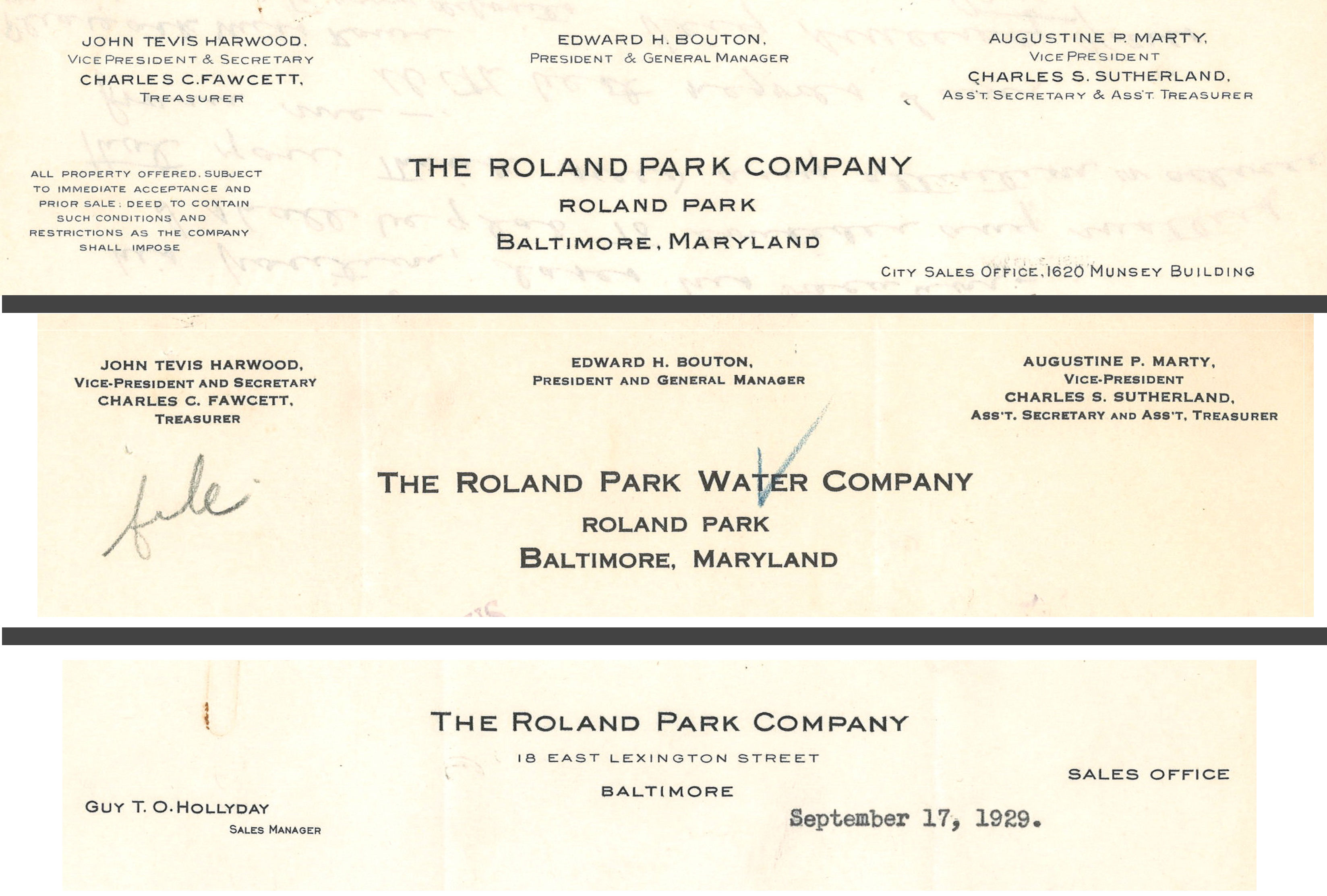
The Roland Park letterhead was indeed rather plain and remained practically unchanged over the company’s long history. Below are three examples from 1920-29, which while created 30-40s years after Bouton’s letter to his printer, are essentially the same as when he first requested the design. These images also demonstrate a consistency of design from the general company letterhead (top) to a sub-company (middle) and finally to an individual within the organization (bottom).
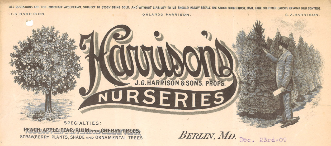
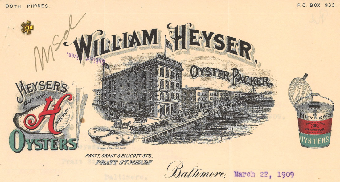
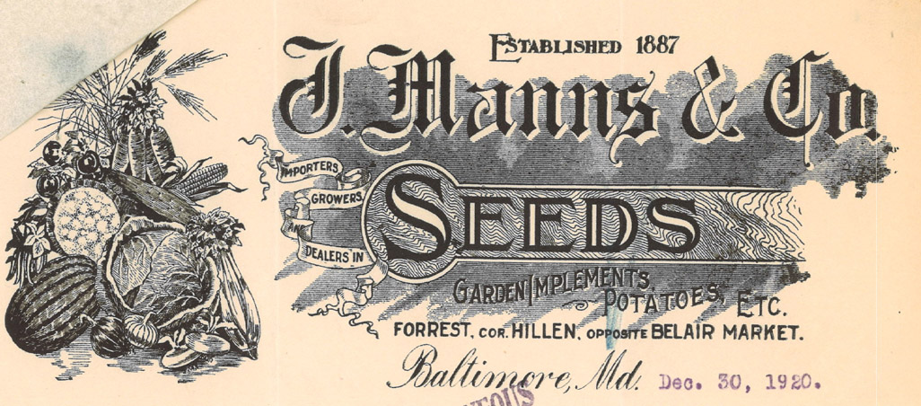
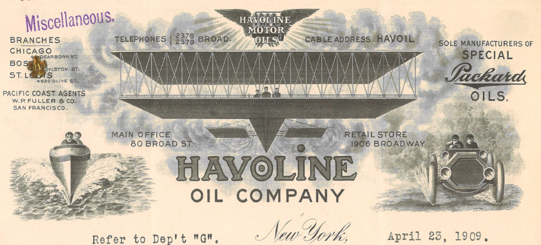
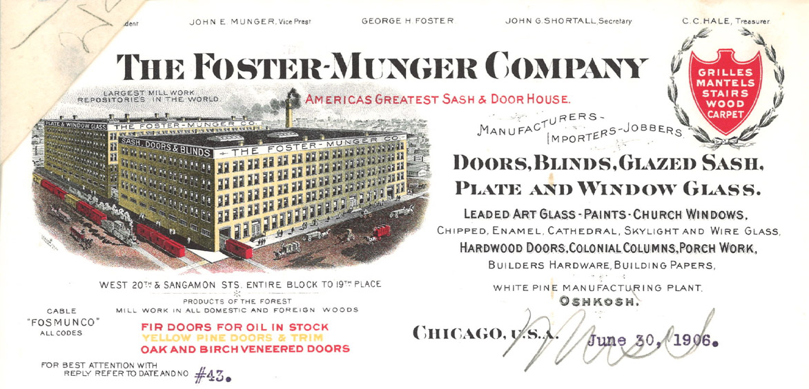
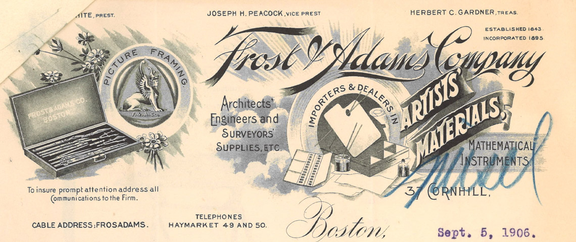
As part of the rich history of the Roland Park Papers, here is a look at the types of stationary that Mr. Bouton wanted to avoid, even while they were embraced by the dozens of companies the RPC was doing business with. These are often quarter-page works of art that highlight the skill of engravers, the architecture of the time, and even a glimpse at color printing.