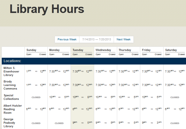
You may have noticed a recently re-designed way to find out when things are open for business around these parts. Simple things don’t come easy, so let’s take a peek into what makes a page.
Background
Our original little hours popup box was designed to be a simple way to see the building hours without needing to go to another page on the site. As time progressed, features were added, and more information needed to be expressed, this design was getting a little big for its britches. Among the requested features included the hours for other Sheridan Libraries locations as well as hours for our staffed service areas around the library.
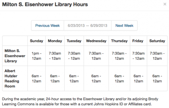
This wouldn’t be a library project without conducting some research. As library hours are not a problem unique to Hopkins (The problem being: How do you display opening and closing hours for many different locations and services in an easy-to-read and easy-to-find way?), I took a look at how other folks were tackling the problem. UMich, for example, has three (long) pages of locations and services, displaying each one in its own weekly grid that you must click through for further hours. Stanford Library’s hours page is a bit more aesthetically pleasing, but it, too, is very long and it tries to squeeze as much information as possible into small spaces by very tightly abbreviating words, sacrificing clarity.
Conceptual Inspiration
Okay, so where do you see lots of times listed all at once? How do they approach it? Train station signboards, airport displays, and bus schedules are excellent examples of similar information layouts.

A few Google Image searches later and some patterns emerge: well-defined vertical columns, clear spacing between time and location, and visual guides that allow you to move your eye without becoming lost.
Mock it Up!
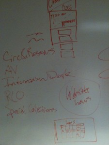
Having gotten a lay of the land, it’s time to sketch. Drawing it out is fast and easy and doesn’t cost any development time. It’s a lot easier to try out how things will look visually without fighting with computers or programming.
After a few sketches and some brainstorming, the most refined concept was coded up as a webpage to play with. At this point, it looked serviceable, but it was a lot of information to take in all at once.
There’s a guideline in information design (and cognitive psychology) that states that the human brain can at most hold between 5 and 9 items in working memory. Anything above that and things feel cumbersome.
Given that guideline, I broke up the list of hours into subcategories of Locations and Services. After all, if you want to know when the Info Desk is open, you don’t want to have to wade through irrelevant listings of building hours as well. It gives your brain something to latch on to.
Call in Reinforcements
At this point, the locations and services felt right, but I needed to be sure. The Info Desk answers a lot of questions related to hours. When you ask a question at the Info Desk, we jot down pertinent bits to keep a little record of it. One of our staff members is in charge of taking a look at those bits, and she was extremely helpful in pointing out which are the locations and services that are most inquired about. This data also provided a ranking for the page, with the most sought after locations first, to make them the easiest to find.
Three days into design and prototyping, I needed to step back a bit. I printed off the mockup and we asked a small sample of users what they thought. Users included security guards, Info Desk employees, students, and staff members; the very folks that would need to refer to this information regularly.
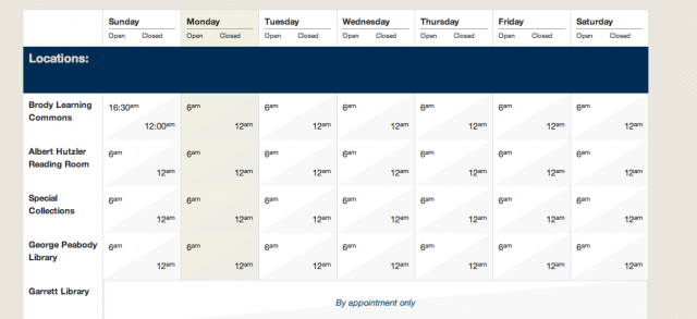
The feedback was mixed. There was too much visual clutter. A visual that tried to establish day and night wasn’t working for users. Important elements were missing from the page. Things were unclear.
This whole process took about fifteen minutes, but it proved invaluable for giving a direction for further refinement.
Coding
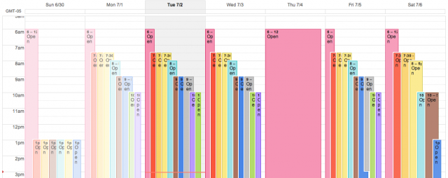
While the user testing was taking place, I began making the page dynamic. All of the hours information is stored in Google Calendar, which needs to be populated with all of the various opening and closing hours as well as holidays and other special occasions.
As you can see, Google Calendar doesn’t provide a great visual for this set of information either.
Portable Polish
After everything was hooked up to Google Calendar and all of the programming logic was wired into the page, adjustments needed to be made for tablets and mobile devices.
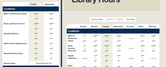
When the page is adjusted for the narrower space of these devices, the opening and closing times no longer fit into their clean columns, so tweaks were put in to list the information in a more vertical manner. These devices also lack a mouse cursor that we can use to highlight sections of the page, so very faint horizontal lines were added into the layout to improve the readability in a more squeezed space.
The complete week listing was never going to work on a phone. It is simply too wide a set of information to easily display on that device without incurring a ton of pinching and zooming. To solve this problem, the hours were limited to only the current day and and the next day. These three columns of information fit nicely in the space provided on a smartphone and provide the information most needed for on-the-go lookups.
Wrap Up
So, there you have it. A readable list of library location and service hours with adaptive interfaces for tablets and phones, user tested, and backed by dynamic data coming from Google Calendar.
