 A building with the latest technology, designed with users in mind and intended to be the heart of the campus. Makes you think of the Brody Learning Commons, right? Well, actually, it describes the intent behind the MSEL. Looking at the building today, it’s hard to imagine that these were the goals for it, but that is what the architects had in mind.
Much like today, the architects were challenged to replace a library (in Gilman Hall) that students interviewed by the News-Letter in 1960 described as “deplorable…monstrously crowded…full almost to the point of overflowing…archaic…disgusting… [and] hardly conducive to efficiency” (News-Letter, October 21, 1960).
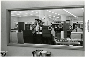
When the MSEL opened in 1964, it contained a cutting-edge computing center (above left) featuring the latest in IBM mainframe technology. The two IBM 1401 mainframes were connected to APL and the Welch Medical Library, launching a history of collaboration with our library colleagues that continues to this day.
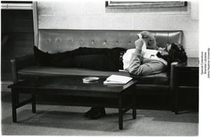
 What about the people side? I think we’d all agree that MSEL is less than user-friendly. But really, condemning us to life underground truly was not the architects’ intent. When it opened, the Baltimore Sun noted the clever way the architects introduced light through the south-end windows, and provided living-room like sofas and chairs in the lounge areas. An earlier Sun journalist described during the design phase that “Color will be used on wall surfaces and books sacks and furniture along with good fluorescent lighting to brighten up the area where no natural light will penetrate” (July 22, 1962).
As time went on, we became victims of our own success. We definitely became the heart of the campus, but the comfy lounge areas gave way to study carrels made necessary by growing student enrollment, and the “good fluorescent lighting” never really met expectations. The time had come to find a way to return to our original intentions. And thus the path to Brody began.
